

It’s not too often that a decade comes to an end, but when it does a unique opportunity arises. All of a sudden you have this perfect ten-year window to remember how it was when it began and on how much you (or the things around you) had changed by the end. The years that bookend the decade create these reference points that make comparing and contrasting particularly easy. And while most might stick to a purely personal retrospective, I thought it would be interesting to take music on a similar journey and reflect on how music has changed from the perspective of arguably the biggest musical influencer of the decade, the Spotify algorithm.
Luckily, I was able to find a dataset that had a lot of what I was looking for. This dataset from Kaggle.com user, Lenardo Henrique, has data about the most popular songs on Spotify from 2010 to 2019 and using this data I was hoping to glean some insight about the trends of the most popular music over the past decade. However, it is important to keep in mind that Spotify was not as large a platform in 2010 as it is now, so I expect to see some bias towards songs that were released in the latter years of the decade as that is when Spotify is seeing their peak user base. The songs on this list were also categorized algorithmically, meaning that no human has ever touched this data. Each value and each label are all computer-generated and when dealing with something as subjective as music there are bound to be some misclassifications or values that might seem erroneous to human music listeners. However, I trust the machine learning team at Spotify enough, such that they would be able to capture the overall trends of the most popular songs on their platform to a degree of relatively high accuracy. So with that in mind, let’s get into the findings.
After looking at the different variables in the dataset I thought “duration” would be an interesting one to look at because I honestly didn’t know what to expect. I had no idea whether song length would increase, decrease, or stay consistent over the course of the 2010s and after plotting the average song duration per year the results were pretty interesting. After a maximum in 2011 of about four minutes, the average popular song length slowly trended downwards with a sharp drop between 2018 and 2019 from about three minutes and 40 seconds to about three minutes and 20 seconds. And while this might not seem like a massive drop in song duration it shows that popular music listeners are fine with shorter songs and record producers are happy to oblige.

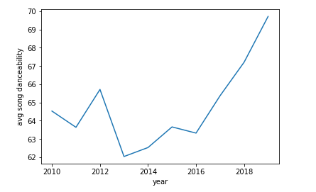
This made me wonder about other aspects of the songs and whether a shorter duration leads means tighter, punchier songs. The dataset helped me out there with some convenient variables called energy or danceability which seemed like they’d be interesting to plot year to year. I wasn’t quite sure what they meant yet, but I thought I’d plot first and ask questions later. What I got were some actual trends, and while the trends were gradual there seemed to be patterns that lean towards lower energy and higher danceability in the most popular tracks of the decade. Mean energy value dropped from 78 in 2010 to 65 in 2019 and the mean danceability value increased from 65 in 2010 to 70 in 2019.

At first, I was pretty confused as to what these values actually meant and what a song with high energy sounded like compared to a song with low energy. But after listening to an unfair number of party anthems I think I can explain. Songs that have higher beats per minute, as well as more aggressive and loud lead vocals, tend to give a song a higher energy rating while a slower and more subdued instrumentals/vocals skew toward the low end of the energy spectrum. This is ranked on a spectrum from 0 to 99. For instance Pitbull’s legendary banger “Don’t Stop The Party (feat. TJR)” is one of the highest energy songs in the dataset with a value of 96, contrasted by Adele’s ballad “Million Years Ago” being the lowest energy song possible with a value of 0. So energy ranking pretty much equates to “is it banger?” A song that was near the average energy level for the early 2010s would be Kelly Rowland’s “Freak” while an average energy level for the late 2010s sounds more like Demi Lovato’s “Sorry Not Sorry.”
As far as danceability is concerned the songs with a higher danceability value seemed to have a larger emphasis on catchy percussion and quick grooves, which makes sense to me. If you’re trying to let loose, it’s the rhythm of the song that takes you from mere foot taps to throwin’ it back in the middle of Kams. Similarly, this variable is also on a spectrum from 0 to 99, with the higher value meaning more danceable. Songs that had higher danceability values were songs like N.E.R.D’s “Lemon” and Cardi B’s “Drip (feat. Migos)” (92 and 97 respectively), while the lower end of danceability values were populated with songs like ZAYN’s “Dusk Til Dawn” and Florence + The Machine’s “St Jude” (both 26). Lower danceability tended to mean more ethereal sounds that promoted chilling on the couch rather than hitting the town. A song that is in the average danceability range of the early 2010s would be a track like One Direction’s “Kiss You,” while a track with an average danceability value from the late 2010s would be a track like Troy Sivan’s “My My My!”
Over the course of the 2010s music has been gradually losing energy, yet it has also been gradually gaining danceability. To me, this reads as the production of songs is getting cleaner as the years progress. Artists are relying a little bit more on instrumentals to make a song hit as rather than the brute force method of quick, loud instrumentals mixed with the catchy chant. Take “TikTok” by Ke$ha and “All Around The World” by R3HAB. Both have similar popularity ratings, according to Spotify, as well as similar levels in energy and danceability. “TikTok” came out in 2010 and “Call You Mine” came out in 2019 and listening to the two back to back, you’ll notice that the more recent track has a much cleaner instrumental and is also much more reliant on the instrumental to carry the song. I think it’s this trend that makes tracks more danceable, while also decreasing the energy that had earlier been present to more chantlike, anthemic lead vocals.
So with average song energy trending slowly downward and average song danceability trending slowly upward, what does the next decade’s pop music sound like? To find out I narrowed the dataset down to songs with energy value less than 50 and danceability value greater than 80 to try to get the extreme examples of the trends we’ve seen building this past decade. The results were super interesting and I was a little surprised at how similar the sound of some of the tracks ended up being. “Bad Liar” by Selena Gomez, “Only Human” by the Jonas Brothers, and “Talk (feat Disclosure)” by Khalid were all in the resulting set and all had these super breezy light instrumentals with a heavy emphasis on a groove that the low end created. All the lead vocals also skewed toward the higher side with earworm hooks that try get you into a nice head nod. I think the era of party anthems is coming to end with a new era of lowkey, upbeat bangers emerging as the driving force in popular music, that is at least if the data has anything to say about it.
Looking back on all the songs that came out during the 2010s and how they changed as the years progressed made me realize how varied the last decade of popular music has actually been. At first, I expected to see the same type of songs across the board, but going through this dataset had me appreciating all the different types of bangers that emerged from the musical landscape over the past ten years. It also had me appreciating the direction music was heading and how it was influenced by past hits. Do you think the last decade will ever be realized as one of the best in popular music or will it go down as one of the worst? Only time will tell, but it certainly didn’t stagnate. In fact, I think it evolved quite a bit. There was definitely more change than I thought there would be, which bodes well for the decade to come. If you want to check out the code I used to make the plots and parse the dataset take a look at my Github. If you want to download the dataset and mess around with it yourself check out the original post from Lenardo Henrique on Kaggle.com.